New Organization Creation
- FIGMA
- GOOGLE SHEET
- JIRA
- FIGJAM
Overview
Professional Education Hub is an online marketplace that offers digital medical courses to both individuals and large institutions. If a user adds an organization area to their account, they can benefit greatly.
Client
Shop CPR
Year
2024
Current Feature
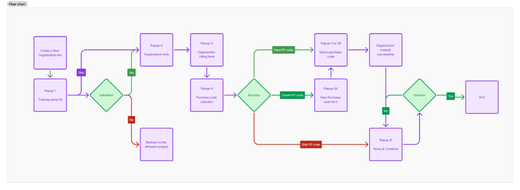
An institutional organizational profile is created as soon as a new user registers in the professional education hub.
The institutional individual user who was a part of the organization during the checkout process receives the best offer.
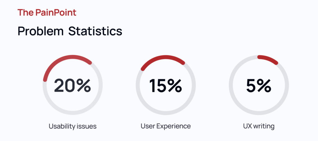
Problem Statement
The current application had numerous usability problems and required lengthy steps to finish the task, which affected user experience.
When terms are disputed throughout the organization creation process, specific sections appear when wandering in loop mode.
Roles & Responsibilities
- Check the UX audit for usability and accessibility painpoints.
- Lead and conduct iterative workshops with designer and tech teams to bring the ideation to solve major issues.
- Prepare a high-fidelity workflow to review with the client.
- Build a full-fledged clickable prototype that ensures a better user experience.
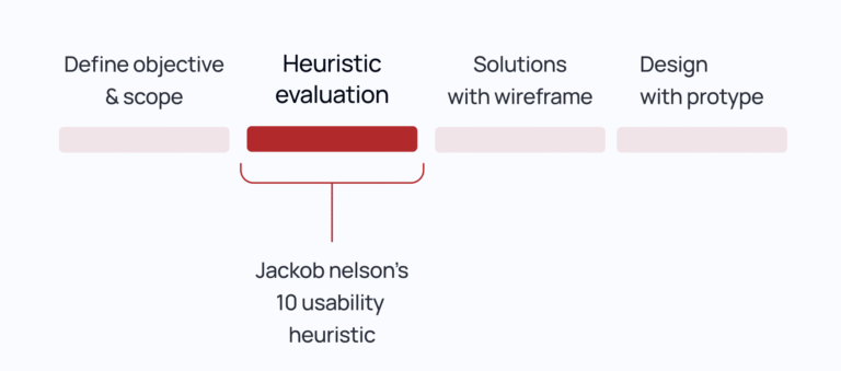
Process
The process began with a detailed UX audit, including heuristic evaluation, accessibility compliance checks (WCAG 2.1), and usability heuristics (Nielsen’s 10 principles), to identify friction points across the interface. I then facilitated cross-functional ideation workshops using design thinking frameworks (e.g., Crazy 8s, How Might We) with the product, design, and engineering teams to co-create and prioritize solutions. Based on the outcomes, I developed high-fidelity user flows and interaction models using Figma, ensuring alignment with user personas and task success criteria. The final output was a fully functional, clickable prototype, validated through usability testing and optimized for real-world user behavior, ready for stakeholder review and developer handoff.
Workflow Structure
- The new account for organizations was complex and inconsistent. Institutions had to manually fill out redundant information, lacked clarity around purchase code benefits, and were often confused about eligibility. Additionally, there was no structured flow to enforce terms and conditions acceptance prior to organization activation.
Heuristic Evaluation
Help & Documentation
Requires a user to fill the field, but they may choose to bypass it by clicking on the link; it could make the user confused.
Aesthetic and Minimalist Design
The layout has to improved because the user action is minimal and the “Company Name” makes it unclear to the user what is is
Consistency and Standard
The design layout and elements are inconsistent with the prior stage.
<aside>
Aesthetic and Minimalist Design
The screens are form only, but the user is prompted to do additional actions by the different pop-up displays.
Consistency and Standard
Lacking consistency in title description in different colors.
Match between system and real world*
Cause the user to become confused before accepting terms and conditions that have been created. After accepting the T&C, if the user declined and logged out and went to the home page, you must agree to the terms on behalf of the new organization if you log in again.
Solutions
List out few major thing need to updated
Common Standard Title
- Context & Orientation, Consistency & Mental Models and Navigation & Control
- It tells users what they are doing and where they are.
- Helps reduce cognitive load by reinforcing task context
Status bar
- Shows system feedback like loading, saving, or submission success/error.
- In long or multi-step forms, it shows progress indicators (e.g., “Step 3 of 5”)—helping users track their progress and avoid form abandonment.
- Can display validation errors, system messages, or success confirmations clearly and accessibly.
- Reduces uncertainty during async actions like form submission.
- Reassures users that their input is being processed, saved, or submitted, avoiding duplicate actions and confusion.
Standard Pop-up Size
- When pop-ups vary in size unnecessarily, users have to reorient themselves each time.
- Consistency creates a predictable interaction model, which is easier to process and leads to faster comprehension.
- Sudden size shifts can cause layout jumpiness, leading to a poor and sometimes jarring experience.
- Especially on web/mobile, changing dimensions can affect how other elements reflow or animate.
- Uniform sizing ensures that content is placed where users expect it to be, maintaining readability and focus.
- Prevents users from having to hunt around the screen for the close button or primary action.
- On smaller screens, dynamic resizing can cause truncation or scrolling issues.
- Predictable sizes are easier to optimize across breakpoints and maintain accessibility (e.g., ensuring modal content stays within the viewport).
Revised Workflow
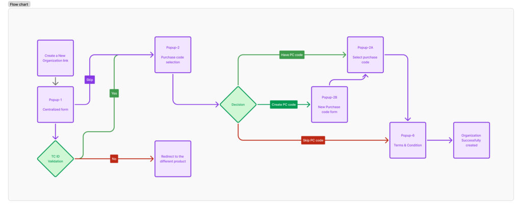
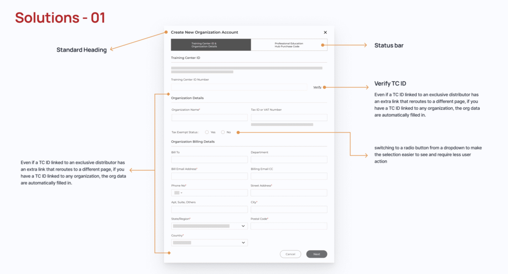
All of the forms are grouped into a single popup window, which also has a common header and a wizard progress bar that tells you how to proceed. The radio buttons have been changed, and the third alternatives in the training center ID field have been eliminated. Add a link to verify ID and auto-fill the information in its place.
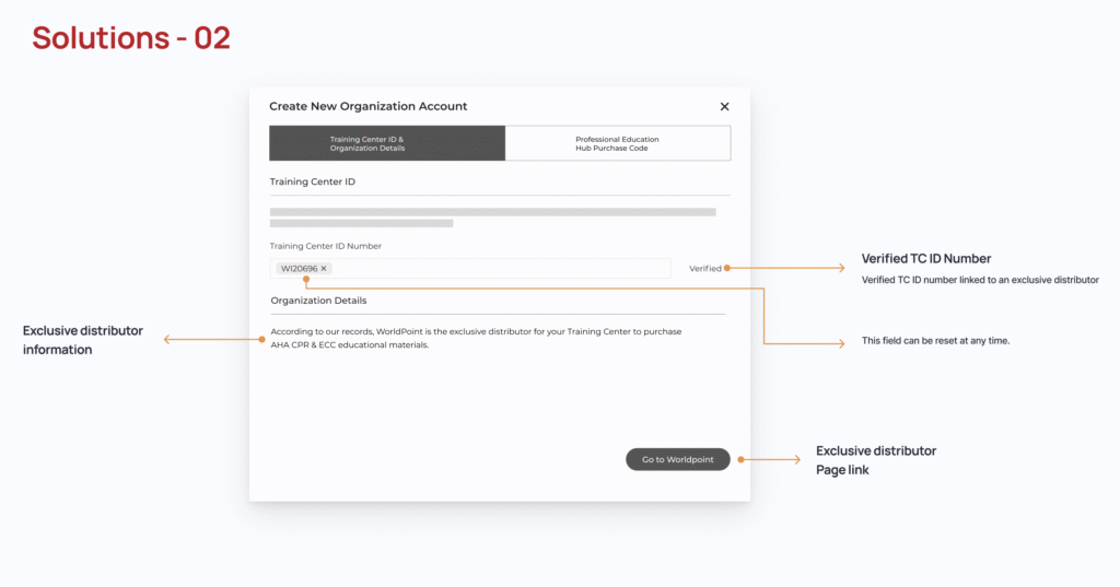
The training center’s ID has been validated, but since the company is listed under a separate product, it ought to route them to that specific product.
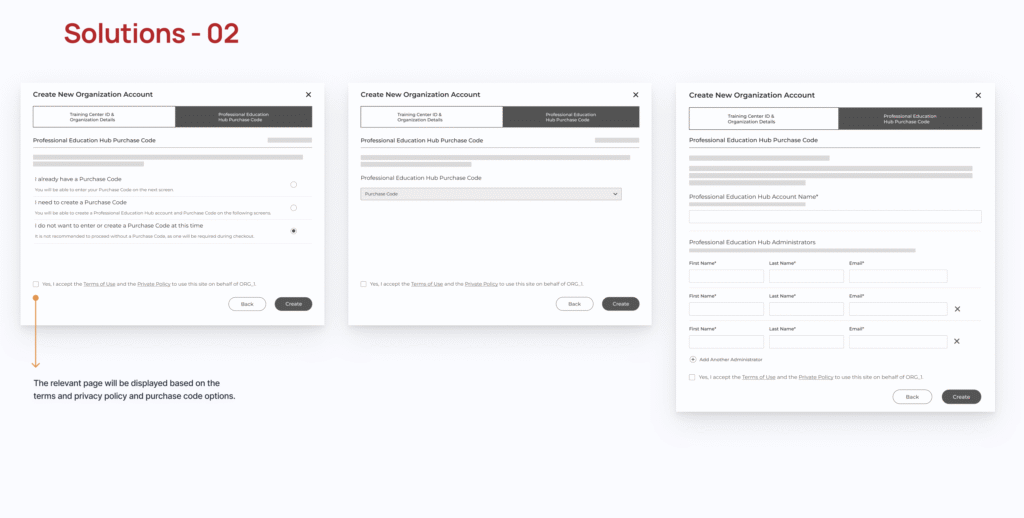
The terms and conditions listed at the bottom will be applied before creating an organization, and the selection screens will alter accordingly.
Design
Check the following link for the prototype design
Impacts
Painpoints: Resolved usability issues and conserved user time and effort.
User Experience: Enhancing the user experience to make it easier to comprehend and simplify user actions.
Performance: Reduce the load time and increase the performance by 22% by centralizing the forms, terms and privacy policy items.
Reflection
Made it more complex to understand the function flow, but in reality those are simple steps to be more user-friendly and avoid extra things.